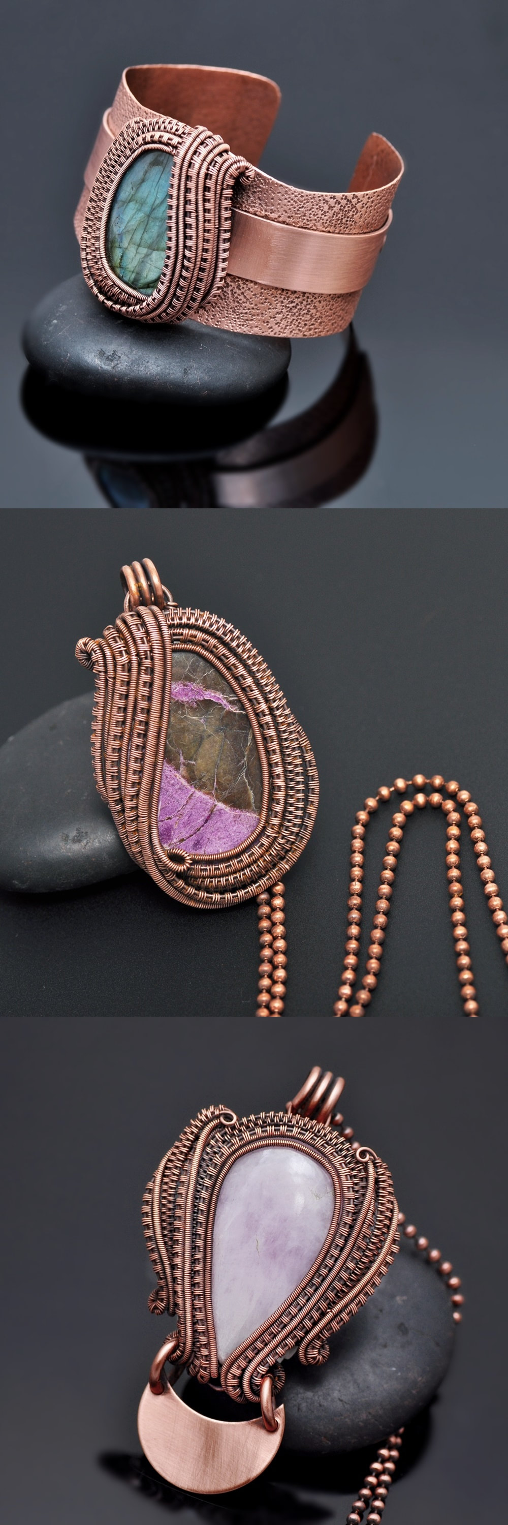
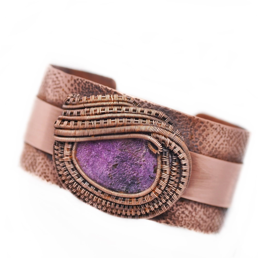
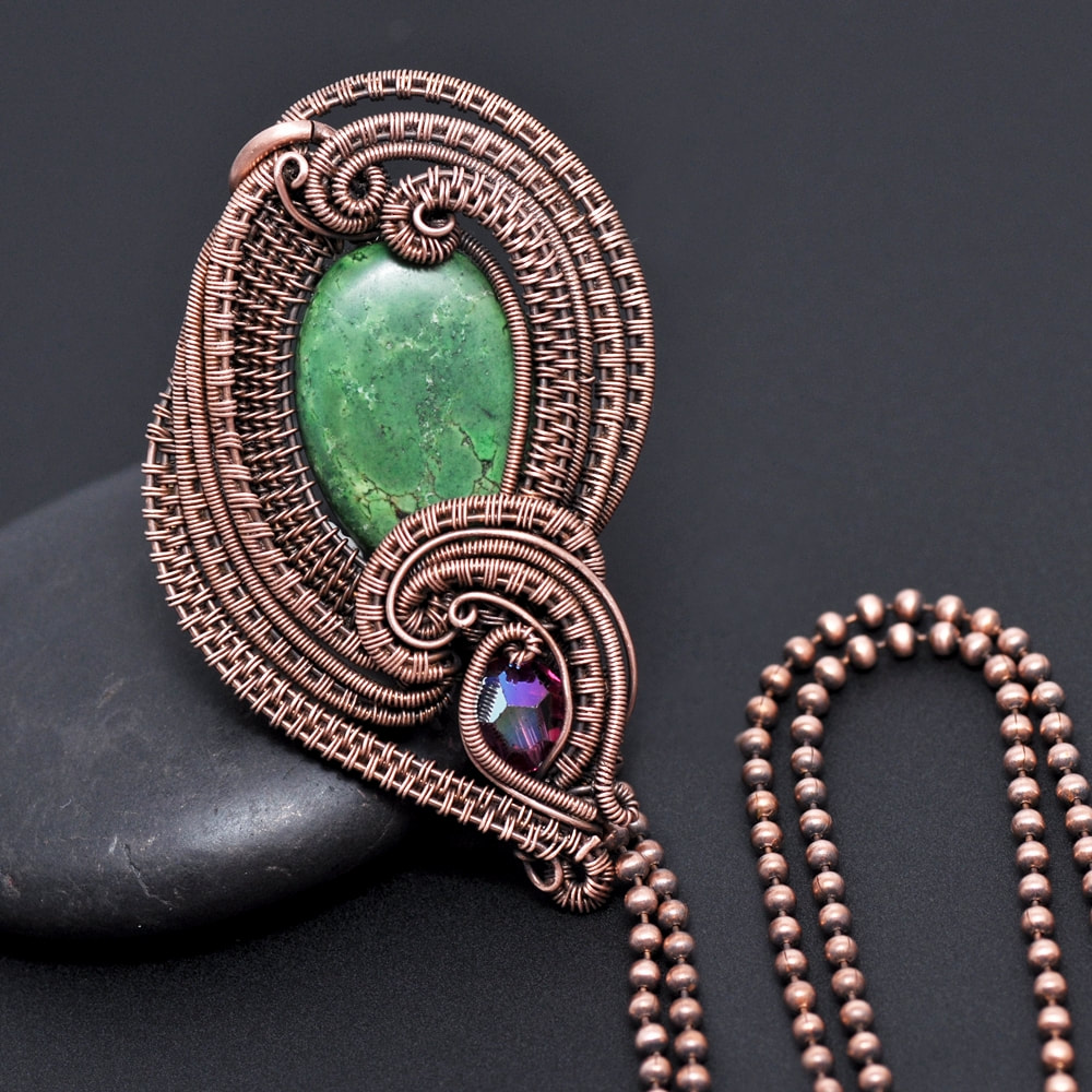
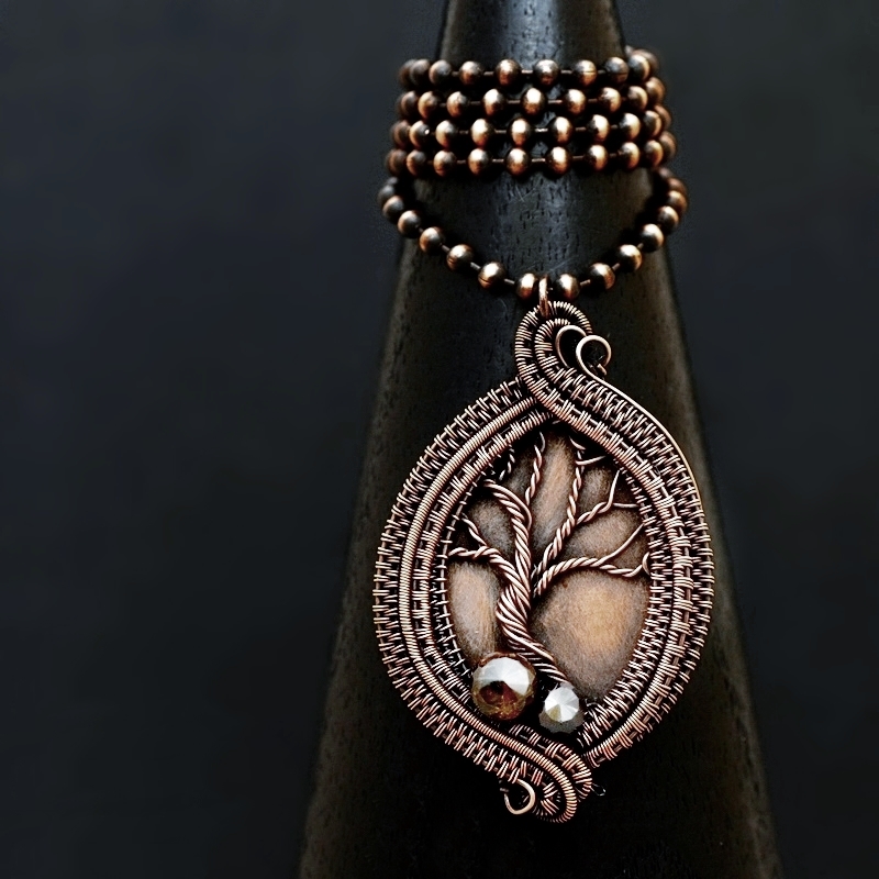
Pure Black or White Backgrounds CONS (an opinion): While the jewelry certainly speaks for itself, pure white or black backgrounds lack a story. I want a complete picture of, not just the product, but the artist, which is sometimes lost in the sterility of white backgrounds, or (conversely) the darkness of its solid black counterpart. The numbers don't lie, and it's proven to boost sales, but it's important that the choice to use a pure white or black background is in line with your brand and image.
Shades of grey tell a story, set a mood that speaks beyond the product itself, without falling into the trap of associations we might often make with other solid color backgrounds. We might see a red background and think "anger", for instance, but grey (or shades of grey) often provide an opportunity to allow the viewer to build a relationship with the image without a deafening demand to react to the image in a prescribed manner. The Wrap Up: In the end, it's ultimately up to the seller to decide what fits his or her branding the best. It's far more important to focus on the consistency and style of the photography than in the color of the background. And to be sure you're telling your story the way you envisioned, through your products and also the way in which you present them to others, and that these things create a cohesive whole.
0 Comments
Your comment will be posted after it is approved.
Leave a Reply. |
Enjoy my content?
Categories
All
Archives
June 2024
Follow Me!Search My Site!
Feed your creative spirit! Shop now! |
|
Check out my private Facebook group for live chats, giveaways and more! CLICK HERE!
|


