Equipment Camera. While it is true you don’t need professional tools, lenses or accessories to create a clean image or atmospheric setting, I will not lie…. it helps. I use a Nikon D90 camera with a 90mm Tamron macro lens, which takes me straight from pet portraiture to product photography in less time than it takes to auto focus. This might seem an excessive camera for most whose needs do not extend as far into professional photography as mine, but macro settings, even on professional cameras, are sometimes insufficient if appropriate accessories are not available (tripods or lights), so I highly recommend a pro-sumer camera and macro lens if funds allow. That is not to say point and shoot cameras are incapable of outrageously sharp images. The Canon G12 ($300) is highly rated for its macro capabilities and is sometimes used as second shooting equipment for professional photographers. If you’re ready to upgrade to a fully manual DSLR, a good beginner camera is the Nikon D3200 or the Canon Rebel. Both of these are of a comparable price ($500), and provide you the opportunity to experiment more heavily with professional product photography, without an outrageous financial burden. A nice mid-range camera is the Nikon D5000, which has unbelievable low-light shooting capabilities, perfect for studio work. Determine which best fits your needs, and ask yourself in what ways you’d like your camera to function, what your budget allows, and how far you’re willing and able to go.
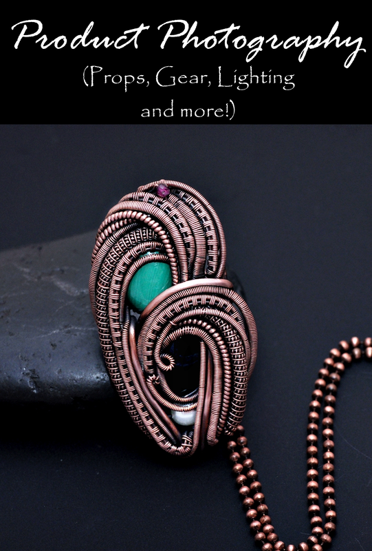
Lens. Though I recommend the purchase of a reliable camera with excellent macro capabilities, typically $300-$500, that does not mean the Kodak EasyShare you got for Christmas wont work. It’s not ideal equipment for product photography, but there are fabulous tools at your disposal to make even the most inexpensive camera take sharp images. The Little BigShot is an image amplifying lens attachment used for most models of point and shoot cameras, at an unbelievably reasonable price. This attachment will transform a $100 camera into a $400 camera with a removable lens and some velcro… because let’s face it…. when is velcro ever bad? Google it, visit the blog, watch the videos, peruse the photos and be amazed. With that said, I stick by my philosophy that a great camera is tantamount to great product photography, and this lens is a wonderful, albeit temporary, solution for artists on a budget. On-Camera Flash. Don’t use it. On-camera flash is, to professional photography, what a child’s wiffle ball is to the NBL. It causes glare, especially on metal or reflective surfaces, which post-processing cannot rectify and which detract from the product or photo focal. Jewelry artists can’t afford to misrepresent their work in an online environment, where the photograph is your only impression. A client can’t appreciate the value of a beautiful piece of labradorite, for instance, if the flash obstructs the “fire” of the stone. If you feel you have absolutely no choice but to use a flash (it's perpetual night) then create a small bubble of wax paper, folded in quarters and tapeed over your flash, and this will help diffuse the intensity of the light. It is not ideal, but it will help reduce the possibility of glare while still providing ample (and usually excessive) light. Though difficult to juggle, especially if your camera is heavy, you can also hold a small white envelope or piece of cardboard between your on-camera flash and the top of the lens, in front of the camera, and angle the envelope or board upwards. This will bounce the light away from the subject, while still filling the room, allowing for an indirect fill light. If you can afford to invest in equipment, purchase an off-camera flash, such as the SB-600 ($250 or less) for Nikon or the Speedlight 320EX for Canon cameras, or ask a sales associate to show you off-camera flash for point and shoot cameras, because they do exist. An off-camera flash is an excellent substitution for full studio lights, with practice, and a phenomenal alternative for the jeweler without the work room or space for a permanent studio. Studio My studio consists of a light tent on a chair and a shop light on either side. Assuming you all have chairs as equally functional, this entire set-up cost $75, including all of my props and bulbs. Amazon has fantastic opportunities for product photographers, including the $10 light tent by Photo Tents (Model PT40), and shop lights, courtesy of Lowe’s at $7 a piece. I own four lights (both sides, back and top), but mostly use only two, depending on the time of day and other available ambient light. Though natural light is the most inexpensive “studio” available, it is, at best, inconsistent. You must avoid direct sunlight (which creates shadow and glare), and the time of day will alter the temperature, white balance and over-all “mood” of your final image. An extra layer of clouds across the sun between shots will create a vast difference between two images and require a great deal more time in post-processing if you aim to provide a cohesive look. Not to mention I’m simply not so dedicated to my craft I will photograph outdoors in a Michigan winter, for the benefit of natural light. Me likey toes. Me no likey frostbite. But do you have to order equipment, you ask. Absolutely not. Is ordering an inexpensive light tent easier than mapping Mother Nature. Yes. Easier than making one and just as cost-effective? You betcha, in my best Sarah Palin voice (which is to say… not her voice at all). And, in my opinion, a far preferable solution. This tent comes with four colored backdrops and folds into a convenient carrying pouch which tucks neatly in my camera backpack. You will NOT find a studio that takes up less room than this, I guarantee, and in my 1000 square foot home, a space saver is a life saver. Pull it out of its case, set it on a chair or dining room table, use an off-camera flash, and I have a portable studio. However, if you are dead set on creating your own light tent, here are a few options for your creative entertainment. Milk Carton. Wash and dry an empty opaque white milk carton. Cut off the top 1/4 in a reasonably straight manner. Place daylight bulbs on either side. Use a cloth, tile or other backdrop and get to shooting. For “floating” images, poke a small hole on either side and run fishing line through the inside of the milk carton. Hang your pendant or product from the fishing line (which wont be seen in the final image), and voila… you have a “floating” pendant. Why is this listed first? Because it’s the cheapest alternative. Not pretty, but functional enough. Tupperware. Oh Tupperware, how my obsessive compulsive disorder loves thee. Tupperware is a great studio alternative and, best yet… you can store your lights, jewelry and tools inside and pack it away when you’re done. Lay your opaque or clear container on its side, line the walls with wax paper to diffuse (or soften) incoming light, place your lights on either side, and you have an insta-tent. I recommend a size no larger than 14″ square for jewelry photography, or your product will get lost in insufficient lighting. The smaller the container, the less room in which the light must reflect… meaning a brighter studio, less work for your camera and a sharper image overall. PVC Pipe. This is my last suggestion because, quite frankly, it’s just too much work in my book. Get yourself enough pipe and connecting elbows to create a box shape, drape an opaque fabric (or wax paper) so all but one side is covered, place lights on the outside and you’re good to go. There are diagrams aplenty available in a generic Google search for PVC Pipe Light Tent. Yes, you can attach clip-on lamps to the pipe, which is convenient, and the pipes can be dismantled for storage, but it’s not as time-friendly a process as the other options mentioned. Creating Atmosphere The inside of my light tent consists of a handful of things: several pieces of 10 x 10″ card stock in different neutral colors, a black river rock, a slate tile, and, if I’m feeling particularly adventurous, a prop head or hand. Keeping these things inside the tent while shooting (with the exception of the prop head or hand) allows for easy transfer of product to achieve multiple photographic looks. I also own a piece of black and white acrylic. Acrylic, as featured in the photograph at the beginning of this post, has a rich professional appeal, with a nice reflection to compliment the piece and a smooth flow of light. I also use small props like the single river rock featured with the stud earrings, however, a porous log, piece of driftwood, bright red or green leaves and pine cones also make excellent props. But the use of backdrop and prop is completely dependent upon the desired mood. Without mood, you have an uninspiring final image. Who wants to buy an uninspiring product? My mood changes frequently and, as such, my photographs do as well. Acrylic for a stylized professional approach. Stone or slate tile for an earthly ambiance, cardstock for an appealing middle ground. Here are a few tips to keep in mind when creating atmosphere in your product photography. Your props should compliment the background and create a subtle contrast. A white rock on a black piece of acrylic, a multicolor leaf, or beans and multiple small accessories all detract from the overall enjoyment of the artistry, and creates a sense of visionary confusion. Your props should not compete for attention, but compliment the focus of attention. A black stone on a piece of gray slate, however, is much more complimentary to one another, and therefore creates no unnecessary contrast to detract from the product. Black props with black backgrounds. White or beige props with white backgrounds. Avoid beans, rice or pebbles, which could detract from detail, especially in wire wrapping or chain mail. These are trusted guidelines for creating solid images. Also, when you change photographic styles, I recommend changing ALL the images in your shop, which should reflect your vision as a unit. Two photographs with a bean background, one photograph with black acrylic, one photograph with doilies and newsprint and scrapbooking paper create an uneasy sense of confusion. This doesn’t mean 128 pieces should be re-photographed immediately, but you should aim to replace several a day in your effort to achieve a cohesive look. Technique Techniques will always vary dependent upon the camera, lenses or other equipment at your disposal, but those offered here will be generically applied to all. First. I recommend a photo-editing software that extends beyond that which comes with your camera or installed on your computer. They are, and always will be, woefully insufficient for the processing of professional images. Photoscape is an excellent program, free, easy to use, and works well on laptops, netbooks or hardware that has little available space. Gimp is free, but hardly user-friendly unless you are familiar with extensive programs like Photoshop, and it can monopolize a lot of space on a netbook, and slow your computer to a crawl. If you have the computer capacity and the funds, I highly recommend Lightroom 3 (Lightroom 4 is now available, but not as appropriate for beginners) for photographic editing, which is easier to use than Photoscape, providing extensive user control, and is wildly more affordable than other Adobe post-processing or image manipulation programs at just $75. Second. Learn. Your. Camera. Read your manual…. and then read it again. Take shots in every mode allowable by your camera, in every possible lighting scenario. And keep in mind these terms: ISO – determines how sensitive your camera is to available or ambient light, Aperture – the size of the opening of the lens through which light enters, and Shutter Speed – the speed at which the shutter of your lens opens and closes and the amount of time during which light is available to the sensors of your camera. Too much light (slow shutter speed) will wash out a photograph and create motion blur. Too little light (fast shutter speed or small aperture) and your product will be underexposed. And though excellent photo editing programs can recover some poorly shot images, getting it right in camera will save you time you never knew you were wasting. Depending on your camera, keep your ISO at 400 or less (point and shoot) or 1000 or less (most DSLRs). Higher ISO and your pictures will contain noise or grain which cannot be removed post-process without sacrificing the integrity of the final image. To keep your ISO at one of these manageable levels, you may need to adjust your settings manually and take your camera off Auto Mode for full control. Aperture Priority (usually indicated by an A on your camera mode dial) is sometimes preferable as it creates a sense of depth with appropriately placed background blur, as seen in the image of the stud earrings above. Note how the stone and earrings are in focus, but the background (which is a ridged piece of gray card stock) appears to be a nice smooth surface with consistent color? That is all thanks to an appropriate aperture setting of about f/8, though exact settings will depend on how close to the subject you intend to get. The further from your subject you get, the more your camera will see your background and subject as existing on a similar “plane”, reducing background blur and creating more focus. You can also use Aperture or Shutter Priority modes, which allows the operator to set only the Aperture or Shutter Speed to a desired level, and adjusts all other elements automatically. It’s a step up from Auto, while still allowing for a high degree of ease. Just remember the following: a larger aperture allows for more light and creates more depth-by-blur, represented by a small F-Number (f/4), and a smaller aperture allows less light and creates more focus, represented by a large F-Number or F-Stop (f/18). In the photo of the stud earrings, I felt the ridged backing board would detract from the jewelry if it were in focus, so I chose to use a larger F-Stop. In the photo at the beginning of this post, background blur wasn’t the desired effect, and full focus was preferred, so I used a smaller F-Stop of f/16. Third. Tripods. When using a point and shoot camera, especially, (though this holds true for mid-range and professional DSLR’s as well) which doesn’t allow for low-light or studio work, you may find your camera automatically compensates for low light conditions by adjusting its shutter speed to less than 1/60 of a second, in most cases. Sometimes adjusting to as slow as 1/3 of a second! Any shutter speed less than the length of your lens is unacceptable for quality images. A 90mm lens, for instance, requires at least 1/90 of a second shutter speed, assuming you are holding your camera in hand. At 1/60 of a second, with camera in hand, you begin to fall victim to camera shake. What’s camera shake, you ask? It’s when, during that 1/60 of a second, your camera records all the movements you make while holding it. This presents itself as unintentional blur in your shots, resulting in soft edges and a loss of detail. A tripod allows you to stabilize your camera and prevent operator movement (and its resulting blur), and for point and shoot cameras is remarkably affordable ($30 or less) and, in my opinion, absolutely necessary. With a tripod, you can use a slower shutter speed in less light, without capturing unintentional movement. This will provide cleaner and sharper images overall. Fourth. Use sufficient lighting. The more lighting you have the less work your camera has to do to capture a clear image. If an off-camera flash is out of your budget, daylight bulbs and shop lamps are a wonderful addition to any studio. They allow you to shoot any time of day or year, regardless of the elements, and gives a consistent stream of light every time, assuming your set-up remains the same. An important thing to remember in regards to lighting is that your lights or flash should never point directly at your subject. Your camera will read this as “Woah! Too much light!” and will likely over or under expose the shot. If using shop lights, place them directly to the sides and above your product. Rely on your light tent to bounce the light an appropriate amount. If using an off-camera flash, adjust so the flash bounces off the inside top or side of your light tent. The white walls will do their magic and move that light around in the 1/100 of a second it takes to finalize your shot in-camera. Fifth. Post process. You may think your image is fine in camera, but in almost every conceivable scenario, (save a professional photography studio) it needs to be post processed in an editing program to achieve a professional look. If you aren’t using gray cards in your shots (you can find YouTube videos to explain the use of these) the temperature or warmth, white balance or tone, clarity or contrast enhancement, brightness and depth are all things to adjust manually per the allowable limits of your software. Adjusting these allow you to maintain true color and richness that amateur photographic equipment simply cannot process, and sufficient lighting cannot always provide. Play with your software, learn every available function and, most importantly, have fun! Keep in mind, however, over-processing an image, especially an image from a point and shoot camera, which, by its nature, has less pixels and less “information” with which to work, may damage the integrity of the shot. If your camera allows, shoot in RAW (read your camera manual for further information), and over-processing becomes less likely. And please, try not to crop a full res image down to a tiny square in the center of the shot where your subject rests. Get CLOSE to your subject and shoot. Don't shoot far and crop close, which will degrade the image and, depending upon the severity of the crop, cause horrible pixelization and photo "fuzz". Sixth. Sharpness. Do not have fun at the expensive of abusing the “sharpness” function on your editing software. If you have sufficient lighting, a dependable camera and whatever accessories necessary, dependent upon your other gear, you should never have to adjust the sharpness of an image during post processing. This creates a type of unattractive static which looks fake and generally unappealing. The sharpness button will not hide nor detract from motion blur captured in your image, which is a common misconception. Avoid it like the plague and your images will have naturally appealing focus. If you find yourself gravitating towards the sharpness button, delete the photo, turn off your software and start again in-studio. Add an additional light and, when a tripod is unavailable, prop your camera on a steady surface to shoot. Retake your shot and apply to your editing software again. Notes Floating Jewelry. To create the look of weightless or floating jewelry, stand a piece of card stock against the back wall of your light tent, hang the earrings over a small stick (I actually used a bottle rocket stick!), place that stick over the ridges of two glasses, at least five inches from your backdrop, and begin to shoot! I like to tilt my camera when shooting, to really fill the frame. If shooting straight up and down, you end up with empty (or negative) space on either side of the pair of earrings, which I find less effective than shooting corner to corner. Use a larger Aperture (remember, that’s a small F-number), which will reduce the focus on the back drop, and you have yourself a pair of floating earrings. You may need to crop (slightly) the very top of the earrings out of frame to hide or remove the stick, or, if you are handy with photo editing programs, you can remove the stick if it shows with some technical graphics know-how. Photoscape has a “clone stamp” which allows you to effectively remove unwanted elements from a shot, and for which you can find how-to information on their website or YouTube. Wearing Jewelry in Shots. I have neither the hands nor the neck nor the ears to compliment the jewelry, and unless you have the hands, ears or the neck, or employ a model who does, I would avoid the use of your own body parts in shots. Nothing detracts from a beautiful piece of jewelry more than damaged skin on which it rests. Or, in my case, damaged skin, broken nails, and blotchy tone! Use head forms, neck forms or hand forms, which can usually all be purchased for less than $10 a piece, and remember to correspond the color of your forms with the color of your background for a great cohesive look. Reflective surfaces. Avoid them. Acrylic is an acceptable reflective surface if you are using studio lights only, and a sufficient number of them, but an on or off-camera flash will completely destroy the integrity of your shot on any reflective surface unless heavily diffused first. Avoid using neck forms, displays or cloth that are reflective in nature, such as any high-shine leather, silk, or faux suede. The faux suede has tiny fibers which are all reflective in nature. You’ll find, in photos using these types of displays, every fiber is visible and reflecting the light away, ultimately, from your subject. Display forms and props are best if made from a faux (or real) wood or plastic that has a matte finish. Watermark. I highly recommend watermarking your images, at least until your brand and style are recognizable. In a technological age where images are, sometimes, used without permission, making sure your name is attached is incredibly important. Keep your watermark consistent between your images, and in frame but off your subject. You can even watermark with a website, if your web address is small enough. And that’s it. That’s Nicole Hanna Photography 101 in a nutshell, or a conch shell… or some other slightly larger shell. Some of these tips and techniques may not apply, and others you may blatantly choose to ignore and, you know what? That’s FINE! I don’t blame you if all the F-Stops and Aperture talk made your eyes glaze over while you succumbed to unintentional drool. Ultimately, the real challenge is to find your photographic voice, capture it and share it with others in a manner your clients find appealing. Do that, and your job is done. And, on your journey, I wish you the best of luck. Maybe I’ll meet up with you somewhere along the way. After all, I’m still discovering my voice as well.
6 Comments
On May 12, 2014
Last weekend was the quarterly, local Holistic Festival. Though I hadn’t attended in years, not since renting my last table, it somehow still holds me in its warm grip. The people are kind, the energy inviting and the creativity easily contagious. Unable to attend, the notice I received about the event managed to stir up in me a few memories of the bygone days of craft shows, both as a vendor and consumer. And, as is always the case when one of these festival dates arrive around the calendar bend, I’m reminded of a particular instance when my wire wrapping was still a budding possibility and hadn’t yet rolled around in the soft sounds of its own voice, and another vendor (who I imagine felt he was doing myself, himself and the crafting community as a whole a great service) approached me and my work with criticism. “Your prices are undercutting mine.” “You should be wrapping in sterling silver or gold. Everything else is substandard.” “Copper makes your work look cheap.” Mild discouragement with the first comment. Then, with his second, doubt began to tip-toe towards the gods of good reason and push them over the edge of my own self-consciousness, one by one, each screaming an echoing, sad refrain. But the third…. the third made me angry. And with that anger, I smiled sweetly at him, thanked him for his advice and continued to work. Because the only ways to silence the criticisms of others is to either shut your ears to them, or (in cases in which they are intended with a good heart) take them and endeavor to learn from them. In this case, I endeavored to learn. And I learned sometimes people have opinions founded in nothing but their own prejudice and selfishness. Sometimes, they’re rude, and push beyond the boundaries of polite conversation. Sometimes, despite my lack of experience, I do know better. That day, I found a voice, and my work listened to it and flung open its petals at the sound. Thanks random rude craft show guy! Your criticism was worth something after all, and I’m glad I was strong enough to find that worth. But, finding the worth in words such as those is of secondary concern to having them even been uttered at all. So, with that in mind, here is my list of things, as a vendor or consumer, you just don’t say or do at a craft show or creative event, and still remain in the company of polite and pleasant individuals. Consumers
This list is certainly not all-inclusive, and if you have any suggestions for those looking to attend a craft show, please feel free to add them in the comments below! Happy weaving! Nicole On August 18, 2013
“If you hear a voice within you saying ‘You cannot paint’, then by all means paint, and that voice will be silenced” ~ Vincent Van Gogh I want to preface this post by saying the following: Being regarded as a professional is usually only important to the artist. A buyer, for the most part, buys a creative project or piece because he or she finds it appealing, not because the artist has post-graduate experience in the field, has been featured in galleries or earns a majority of their income from their craft. Though these qualifications are something in which to have great pride, they do not really (or solely, at least) qualify an artist as a professional or quantify a degree of professionalism. I would never presume to define the techniques or education of an artist as professional or amateur unless I was the customer purchasing the product. Nor do I think it is the place of anyone to do so unless doing so about themselves or about a product they intend to purchase. On that note, I would like to discuss the term “professional” as regards how we each conduct our own business and consider how it relates to our customer service philosophies and experiences and, perhaps by doing so, shed a little light on the ambiguity (or importance) of the term.But first, let’s define “professional”: Merrium-Webster defines a professional in the following ways: “characterized by or conforming to the technical or ethical standards of a profession; exhibiting a courteous, conscientious, and generally businesslike manner in the workplace; participating for gain or livelihood in an activity or field of endeavor often engaged in by amateurs.” So, a professional is defined as someone who is learned in, and adheres to, the standards by which a field is conducted. Graduate education, for instance, would qualify someone (according to this definition) as a professional. Fair enough. Challenging yourself at an educational institution is a valid way to exhibit dedication to a skill, trade or area of interest and certainly implies to a customer (or employer) a willingness to establish a relationship to which the professional will be likewise dedicated. By these same guidelines, it can also be said that anyone who has exhibited a learned understanding of their field may also be considered a professional, whether attending a University or degree program or not. Now, are these “technical or ethical standards”, however, something to which a professional has to or should conform? Ah, therein lies the real question, and I think the answer depends upon the field of study.A mathematician is required to follow a formula (or technical standard) in order to define the answer to a problem. An artist, on the other hand, is much more free to tug at the boundaries of these standards in order to best represent his or her personal vision. For example, a wire artisan will prepare her work to be wearable, comfortable and clean, but is otherwise free (and encouraged, even) to implement the design in whatever technique best suits her style. A painter may prepare his or her canvas by a technical standard, but is not required to paint that canvas by any standards outside her own aesthetics. An apprenticeship is one of the few exceptions to the “freedom rule”, in that an apprentice will follow the technical standards of her teacher, only inasmuch as she feels the techniques will help define her voice. The techniques of that teacher, however, do not define the standards by which everyone creates or by which a creation, in general, is considered professional. Ultimately, this definition of “professional” is misleading and under-explained, at best, and which next leaves the following definition open for discussion.A professional “participates for gain or livelihood in an activity or field of endeavor often engaged in by amateurs”.This definition makes a distinction between a professional and an amateur, instead of focusing alone on what defines a professional. A babysitter and a nanny, for instance, both make money caring for the children of others, for gain or livelihood. However, according to this definition, one is an amateur and one is a professional, but the distinction is honestly impossible to make, by this definition alone. If the definition only regarded the monetary rewards of work, it might be easier to distinguish between a professional and amateur, but assigning a value is far too dependent on location and standard of living, among a number of others factors. The previous definition, however, can shed some light on the distinction, in that the amount of time (or education) dedicated to the field will assign one or the other the title of professional, but that is to assume these definitions cannot be read or interpreted independently of one another.Now for the last (and for me, most important) possible definition: A professional “exhibits a courteous, conscientious, and businesslike manner in the workplace”. This should be, generally speaking, the easiest to interpret, but unfortunately, we’ve all encountered an unprofessional demeanor with a business owner or employee. Why? Because we all have our own ideas of professional conduct. For instance, I’m quite the fan of a particular gritty, urban photographer, and follow his work frequently on Facebook. His posts are often vulgar and sarcastic which, to some, can be perceived as unprofessional, but when viewed in context of his body of work, it fits the “brand” he’s attempted to establish, while still interacting with his customers in a polite manner.But, in a more generalized scenario, here are a few (and not all-inclusive) guidelines by which I expect a business owner to conduct themselves in a professional manner:
Well, if you aren’t the customer buying the product or service, and you’re not the artist providing that product or service to that particular customer, then it doesn’t mean anything. We all have our own perceptions of what best represents a professional background, product or conduct. This post was only to inspire you to consider your definitions carefully before defining another person (or their art) by them. Buy or make the work you appreciate for the reasons you appreciate them, and don’t let a standard definition undermine your own values, tastes and desires. Art should not be defined by absolutes, but by the limitless expectations of our imaginations. Several years ago when I dared venture towards the wonderful world of wire-weaving, downloading an endless stream of tutorials, visiting and re-visiting the sites of all the most consistently masterful wire-workers (Eni Oken, Iza Malczyk and Magdalena Atelier to name a few) and, when the courage was born, attending every Arts & Crafts show at which I could afford a table, I was suddenly, and somewhat sorrowfully, introduced to the Conflict of Copper.
That's right. The Conflict of Copper... with a capital "C". It's serious business. Statements are only emphatic when utilizing the importance of capital letters. I swear. So there I was, happily engaged in the process of birthing tiny copper disasters which, in a stilted economy, bred tiny trouble-making children, which then crawled, in their infinite innocence, to the Arts & Crafts circuit, which then, by a miracle of the Gods (and my absolute surprise), began to sell, when a benevolent patron of the arts, a soothsayer of economic wisdom (or not so much), informed me that I was Cheating his market. Cheating! (Note the capital "C" for added emphasis.) I harbored this notion, this ridiculous untruth, apparently, that this unassuming, agreeable metal somehow fit perfectly in the wire-working niche, beyond the degrading role of practice metal, beyond the ill-fitting connotation of "cheap", settling comfortably somewhere between the youth of bohemian individuality and the ever-evolving history of the earth. I believed, with unadulterated enthusiasm, the foolish ideal that copper was conceivably comparable to the flawless skin and undeniable weave of its siblings, Sterling Silver and Gold-Filled. Silly me, says the sagacious benefactor of the arts. I was devaluing his work (exclusively silver, mind you), and the work of artisans the globe over, with my tiny copper whelps, born so far on the wrong side of the tracks that a perceptive and discerning clientele blew by them like tumbleweed. And to all his infinite sagacity, his unrelenting pretentiousness and snobbery, my response was this: So? That's right. So what? I don't work with copper because it's inexpensive, nor because the market for this metal fluctuates pennies a year, nor because it's a readily accessible material, and therefore accessible to the client, though these are attributes worthy of praise. I love this metal because it is a ductile collection of electrical current which undulates through the very breath of life, because the world would otherwise lack the beauty of ancient architectural patina, the swirling, conjoining hues of Turquoise, the history of currency, the history of MAN, and yes, even the glorious perfection of sterling silver. The possibility of these things are bright harbingers of a beautiful future, full of color and sunlight, fathered by the presence of an unforgettable, sometimes unacceptable, metal. I made the decision to be as unapologetic as possible. To spit in the face of the presumptuous and arrogant idea that beauty equals financial extravagance. To tell those sagacious economic experts that I will not be bothered by pretense, and find success irregardless of their woefully misguided advice. I've made the decision to live outside the confines of a perceived value. Will you? |
Enjoy my content?
Categories
All
Archives
February 2023
Follow Me!Search My Site!
Feed your creative spirit! Shop now!
|